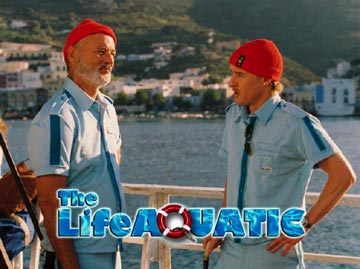
 I came across this image from Wes Anderson’s couldn’t-be-any-more-highly-anticipated film The Life Aquatic (though it seems the “with Steve Zissou” tag has been removed), and it made me laugh. The image is from a Disney promotional PDF that someone over at Yankee Racers found on the Disney site. Since Wes Anderson is, hands down, the most typographically attuned director in the world, it’s pretty hilarious that someone at Disney Corporate used a design approach that’s an evil combination of Out to Sea, Boat Trip, and Finding Nemo (thanks, Aimee, for improving my analysis).
Luckily, the release of the film is still nine months away, and we’ll see Wes and his brother Eric put their stamp on the design and presentation of every aspect of the film. And I’ll bet they never use a life preserver as an “O” or a “Q.”
A Font is Worth a Thousand Adjectives…
March 16th, 2004 · No Comments
Tags: Film